


Who hasn’t had a meandering professional path? Gone are the days of finding one thing and sticking to it until that pension check rolls around (for better or worse). Below you’ll find cameos of those projects that have brought me great senses of pride and accomplishment (or professional growth) over the years, sorted by end date to give you a sense for where the three circles overlap into a beautiful Venn diagram.
When I started my own handmade jewelry business in 2008 I immediately found "my people" in the maker movement and the handmade community. This tribe was eager to share their wealth of knowledge and experience with others, and I jumped on board as fast as I could. Facilitating and leading these types of communities quickly became more important to me than my own handmade business, so I let it go to focus on knowledge-sharing, peer support, and being a resource to those around me—initially through I Heart Art: Portland, then through my own nonprofit, Maker’s Nation, and finally as co-director of Academy of Handmade. And, it turns out, that community spark is what led me into the strategic event professional I am today.
Creative pursuits are the connective tissue between my professional pursuits and evolve as much as I do over the years. I have always found joy in using my hands to design, create, modify, transform, and improve materials. My creativity is manifest in the entrepreneurial (camera lens bracelets), the ephemeral (cooking, gardening), and the permanent (home improvement, building a tiny cabin).
In a three-year stint (2010–2013) as Web & Print Project Manager at Pacific Northwest College of Art and Museum of Contemporary Craft (now defunct), I had the pleasure of managing a number of significant publication projects, including four exhibition catalogues and a major student recruitment campaign. Working on these publications in particular honed my skills in project management, content management, design review, and print production. I can’t say I miss the day job, but I do miss the proofing process and donut-filled early-morning press checks.
I’ve been involved in organizing conferences in various capacities since 2011, but it wasn’t until 2014 that I started to get a knack for things and realize that conference production is totally my jam! A few clients later, I officially incorporated Kickass Conferences and started building a sustainable business focused on event strategy and production for purpose-driven community leaders. Here you’ll find a handful of photos showcasing the range of events I’ve worked on in the past few years, but for the full rundown, you really should just visit KickassConf.com
My partner and I are building a tiny vacation cabin on 12.5 acres in Central Washington overlooking the Columbia River. The full story can be found in my Building Tiny blog, but here's a selection of photos that shows our progress along the way. I'll update this periodically with more as we go.
To commemorate the five-year anniversary of the World Domination Summit we went big and bold with the conference program and transformed it into a 64-page workbook chock full of great content. The history of WDS, profiles on the team members, and details about the conference's core themes led into maps, schedules, and extensive blank pages for note-taking. At the end of the book, we even included perforated "contact cards" for those that didn't have business cards and a self-guided "Interactions" game with tasks for introverts and extroverts alike.
The pages were printed on cream-colored paper to soften the colors and the cover was printed on gray cover stock with an opaque white ink base, giving the artwork a floating feeling.
Key Responsibilities: creative direction, project management, content management, design review, proofreading, layout editing, designer-client liaison
Design by Jolby & Friends
Museum exhibition publication with supplements
The catalog that accompanied the We Tell Ourselves Stories in Order to Live exhibition honors the nine artist recipients of the Hallie Ford Fellowship in the Visual Arts (2010–2012). The fellowship represents a generous unrestricted grant awarded by The Ford Family Foundation to three Oregon-based artists each year.
The 80-page, full-color publication includes photos of studio visits and interviews with each artist conducted by the curator, Cassandra Coblentz, and photographer Matthew Miller. We worked with designer Briar Levit to produce the publication based on her history working on other Museum publications (see Generations: Betty Feves and 75 Gifts for 75 Years) to maintain the Museum's visual aesthetic while also meeting the requirements of the foundation that funded the exhibition and publication.
We worked with the same local printer who produced Generations: Betty Feves to ensure print quality and integrity achieved with other museum publications.
In addition to this catalog, two supplemental pieces were published: a 20-page exhibition checklist designed by David Roos (who also designed the exhibition signage), and later, in early 2014, a 24-page addendum featuring the 2013 Hallie Ford Fellows in the Visual Arts (also designed by Briar Levit). The exhibition has since traveled to several galleries and museums in the western states.
Key responsibilities: Art direction, project management, design review, proofreading, layout editing, designer-client liaison, vendor liaison, print production, press checks
The initial project was completed in my role as Web & Print Project Manager at Pacific Northwest College of Art (PNCA), and the supplement as a freelance project manager working with the Museum of Contemporary Craft. Photos by Briar Levit, used with permission.
About the exhibition (from the MoCC website):
Taking its title from a passage of writing in Joan Didion’s 1979 essay “The White Album,” Los Angeles-based guest curator Cassandra Coblentz employs Didion’s text as an evocative lens through which to view the diverse body of artwork produced by nine distinguished Oregon-based artists who have and continue to make remarkable contributions to the region’s cultural landscape. We Tell Ourselves Stories in Order to Live explores how these contemporary artists embrace a cross-disciplinary approach to art making wherein the legacies of art, craft, and design merge in work that expands and explores the tactile, conceptual, imaginary, material, and critical potential of cultural production.
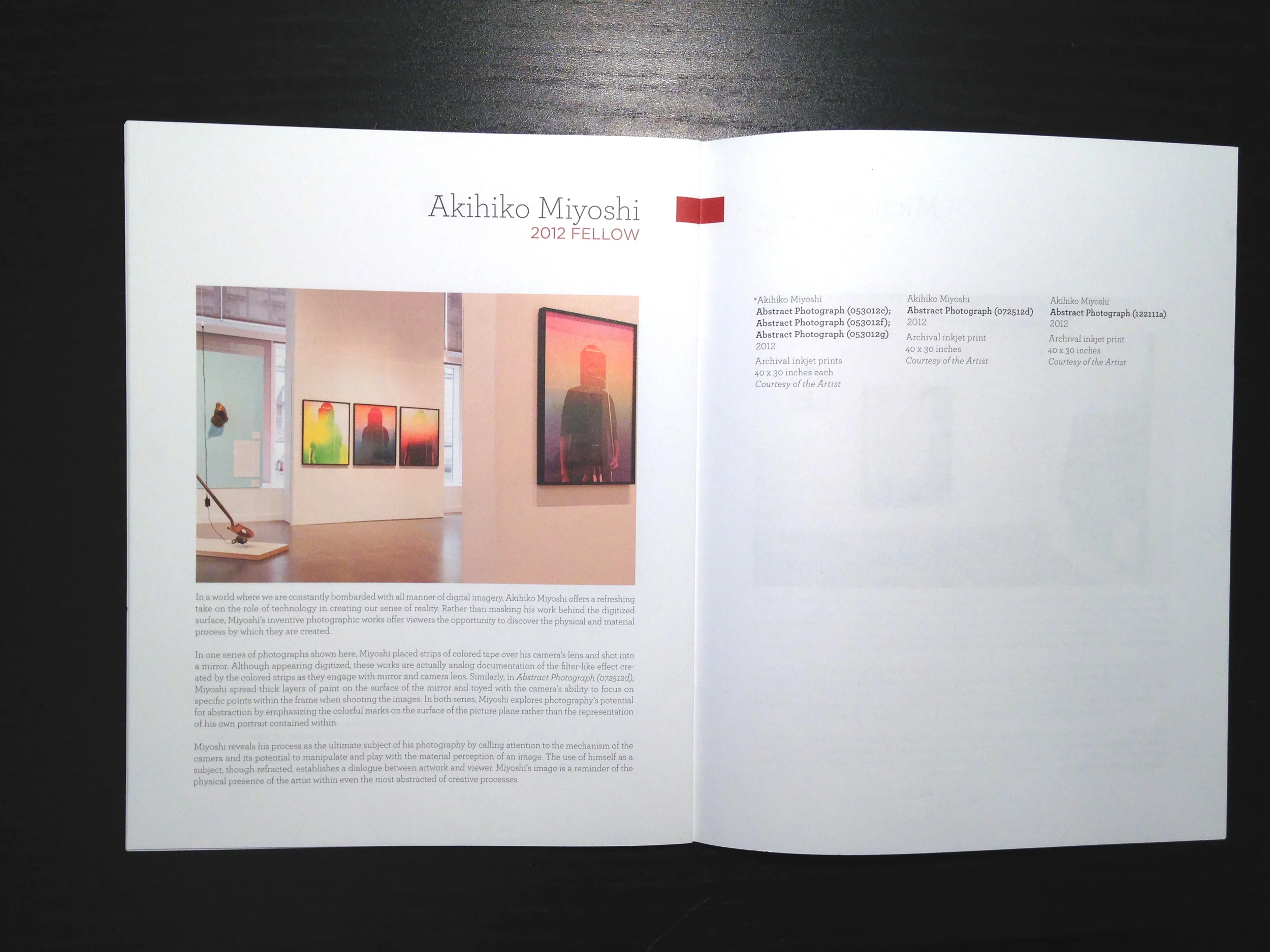
Each of the artists included in the exhibition is a recipient of the prestigious Hallie Ford Fellowship in the Visual Arts. Created to honor the late Mrs. Hallie Ford, co-founder of The Ford Family Foundation and life-long supporter of the visual arts, the fellowships support her belief that all people should have the opportunity to explore and realize their talents. Focused on mid-career artists who demonstrate a depth of practice and potential for significant future accomplishment, the exhibition features the work of Daniel Duford, David Eckard, and Heidi Schwegler (2010); Sang-ah Choi, Bruce Conkle, and Stephen Hayes (2011); Ellen Lesperance, Akihiko Miyoshi, and Michelle Ross (2012); Mike Bray, Cythia Lahti, and D.E. May (2013).
Capital campaign case statement
Creativity Works Here is a transformational capital campaign undertaken by Pacific Northwest College of Art in 2011 to fund the renovation of Portland's historic post office building at 511 NW Broadway into the Arlene and Harold Schnitzer Center for Art and Design, and assist the college in its migration from its current location in the Pearl District to the North Park Blocks.
The identity, branding, and design for this campaign and publication was developed by MetaDesign's San Francisco team, led by PNCA Communication Design alumnus Damien Webb. This publication serves as the principal method for communicating the College's vision for the new building and a park-centered campus to prospective donors. The identity development process was particularly complex as we navigated the needs of the Office of Advancement, President's Office, and Office of Communications to find a balance between storytelling, philanthropic appeal, and overall messaging and positioning.
One of our primary goals with this piece was to produce a high-quality, design-infused publication worthy of a college of art and design. The oversized, 26-page, full-color piece was printed locally with sustainable practices and features a clear foil cover and side-stitched binding.
Key responsibilities: project management, content management, design review, copy editing, layout editing, designer-client liaison, vendor liaison, print production management, press checks
This project was completed in my role as Web & Print Project Manager at Pacific Northwest College of Art (PNCA).
Student recruitment materials
Pacific Northwest College of Art (PNCA) is Portland's flagship college of art and design offering both undergraduate and graduate education. Each year, the College produces key print pieces to assist the admissions team in new student recruitment. As the institution has evolved over the years, so has its identity, and the 2012–2013 recruitment cycle required a cementing of the school's visual identity.
The recruitment publications are the principal means of attracting recent high school graduates and transfer students into the BFA programs. In an effort to move away from marketing a crafty, earthy feel, this catalog needed to offer a bold design and sell Portland as the place to be.
Working closely with the enrollment staff and our in-house graphic designer, we produced a 116-page, full-color undergraduate catalog in an edition of four boldly-colored covers featuring both a silver foil and blind emboss to stand out amongst the tables at college fairs across the country and internationally.
A specific focus was placed on striking photography, a strong storytelling narrative, and compelling student artwork. The publication was printed locally with sustainable practices as well.
In addition, a 52-page graduate program catalog offered a more refined iteration of the same design, catering to a more mature, post-graduate audience of artists and designers, along with a series of postcards, posters, bookmarks, and other collateral used to reinforce the recruitment efforts and communications to prospective students.
Key responsibilities: project management, production management, brand integrity, copyediting, content management, design review, layout review, asset and file preparation, designer-client liaison, vendor liaison, press checks
This project was completed in my role as Web & Print Project Manager at Pacific Northwest College of Art (PNCA).
Exhibition catalog
In conjunction with the annual alumni reunion in 2012, Pacific Northwest College of Art organized Trust, an exhibition featuring juried and invited works from alumni spanning six decades. The largest exhibition of alumni work in the college's history was accompanied by a 44-page, full color exhibition catalog, including an essay from the curator.
In working with Alumni Relations and in-house graphic designer James Hill, we paid special attention to how a variety of media were represented on paper, including video stills, paintings, kinetic sculptures, and site-specific installations of refracted light. We chose a "larger-than-life" size of 9.5" x 13" and printed on uncoated paper with a top-stitched binding and a subtle clear foil cover.
Key responsibilities: art direction, project management, production management, proofreading, content management, design review, layout review, asset and file preparation, designer-client liaison, vendor liaison, press checks
This project was completed in my role as Web & Print Project Manager at Pacific Northwest College of Art (PNCA).
Artist monograph publication
This 192-page, full-color publication was produced in conjunction with the first museum retrospective of Betty Feves' influential ceramic works. The ambitious project was grant-funded and produced in a mere 13 weeks from initial content delivery to having the final product in hand. It also represented the largest catalog the Museum has published to date, and was produced alongside the exhibition itself.
As a truly collaborative effort, five authors (including exhibition curator Namita Wiggers), archival texts, and editors in New York and Chicago contributed to the process, with designers Briar Levit, Clifton Burt, and Sheli Ben-Ner working tirelessly to complete the layout by the deadline.
We chose a local printer with years of experience in publications and a special appreciation for "nursing" the press (very fine-grained control over colors on each signature) to ensure the integrity of the images throughout. The paper stock was chosen to complement the earthy, warm tones of the artist's work without distracting from the quality deserved of an art publication.
Key Responsibilities: creative direction, project management, design review, proofreading, layout editing, designer-client liaison, vendor liaison, print production, press checks
This project was completed in my role as Web & Print Project Manager at Pacific Northwest College of Art (PNCA). Photos by Briar Levit, used with permission.
About the publication (from the MoCC website):
Betty Whiteman Feves (1918–1985) belongs to a generation of mid-century vanguard artists who set the stage for dynamic shifts in the use of clay in art. Feves’ work and life in art subverts the popular, male-dominated narrative of post–World War II ceramics. Academically trained, Feves studied with Clyfford Still and Alexander Archipenko in the late 1930s, worked in a design studio in New York during World War II, then chose to live, work, and raise her four children in Pendleton, Oregon where she remained for the next 40 years.
This publication contextualizes Feves’ functional and sculptural pieces within the greater arc of her work in her community as a mentor, music educator, and advocate for higher education. It explores her commitment to place expressed in forms inspired by the land and created with locally-sourced materials via a continuing process of relentless experimentation. Feves quickly earned a national and international reputation for her work, establishing new approaches to working with clay which shaped the American Craft Movement and the potential of clay as an expressive medium as we understand it today. Generations: Betty Feves situates an under- recognized regional artist within the overlapping arenas of Modernism, the American Craft Movement, and a practice deeply grounded in the Pacific Northwest.
Museum exhibition publication
75 Gifts for 75 Years celebrates the Museum of Contemporary Craft's 75th anniversary with an exhibition of recent gifts to the Museum's permanent collection. This 64-page, full-color publication accompanied the exhibition and provided historical context for the works represented.
I was brought into this project toward the end of its design, specifically to accelerate its completion and maintain the brand integrity of both the Museum of Contemporary Craft and its partner, Pacific Northwest College of Art.
Due to a very limited budget, this publication was printed overseas through a Seattle-based print brokerage specializing in art publications. The book was designed by Briar Levit and Clifton Burt.
Key responsibilities: design review, layout editing, proofreading for style guide and typesetting accuracy, printer's proof review
This project was completed in my role as Web & Print Project Manager at Pacific Northwest College of Art (PNCA). Photos by Briar Levit, used with permission.
About the project (from the MoCC website):
To celebrate the Museum’s 75th Anniversary and role as one of the nation’s oldest institutions dedicated to craft, collectors from the Pacific Northwest and beyond have generously donated and promised gifts to the Museum’s permanent collection. These gifts fill important gaps in the Museum’s work to document craft and its place in culture since 1937. Through a series of programs including connections with PNCA classes, the exhibition shows how gifts to the collection function as a teaching tool in the special learning environment we call “the museum.”
I wouldn't call myself a photographer. I've taken some classes in the past and enjoy the art behind the lens, but I do enjoy traipsing around with my dad's old Canon AE-1 and shooting a roll here and there when I have the time and money to spend on developing. I've also played with a digital camera, and of course now with my iPhone (the best camera is the one that's with you) but my knack, I feel, lies in the post-process editing end of things. I've gathered a selection here of the work that I'm most proud of. I profess no true gift or talent in this regard. I just enjoy it.
All images shown here licensed under a Creative Commons Attribution-NonCommercial 3.0 Unported License. To download these or view more photos, visit my Flickr account.
You can also follow me on Instagram for more mobile adventures.